LAB: Make ControlLooks & Decorators in Haiku
As much as i searched in the web, i was not able to find a small tutorial on how to develop a new window decorator or a controlLook for Haiku OS. For this reason, i propose to make a very small guide to persons that they no have idea what are they doing (like me)… this is more for my memories than with the intention of someone learning something.
EDIT: This adventure was born in the following thread of haiku discuss forum: https://discuss.haiku-os.org/t/decorators-and-controllook/9611/2
Little HaikuOS history:
Haiku began as the OpenBeOS project in 2001, the same year that Be, Inc. was bought by Palm, Inc. and BeOS development was discontinued. The focus of the project was to support the BeOS user community by creating an open-source, backward-compatible replacement for BeOS. The first project by OpenBeOS was a community-created “stop-gap” update for BeOS 5.0.3 in 2002. In 2003, the non-profit organization Haiku, Inc. was registered in Rochester, New York, to financially support development, and in 2004, after a notification of infringement of Palm’s trademark of the BeOS name was sent to OpenBeOS, the project was renamed Haiku.

More fun in: https://en.wikipedia.org/wiki/BeOS / https://www.haiku-os.org/
Understand what is an addon
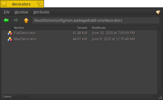
A software add-on is any third-party software program or script that is added to a program to give it additional features and abilities. Beos and Haiku uses the add-ons as a simple way to add caracteristics to the operative system. if you see in your files at the config directory provably see something like this structure:
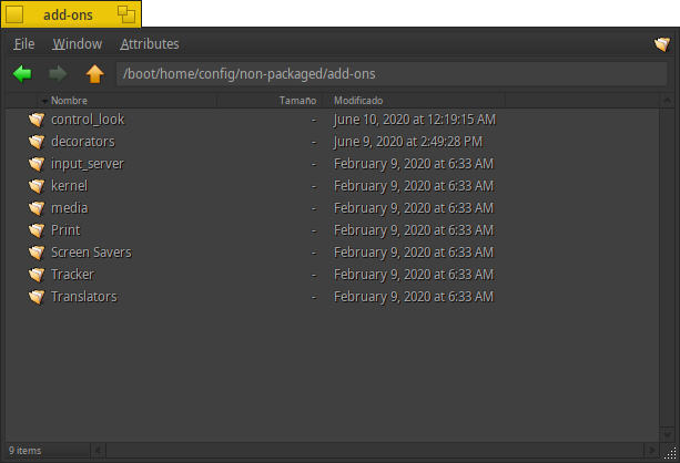
In this folder you can add the addons what you like. Haiku have two folders when to put the addons “non-packaged” and “packaged”, the reason of why these guys make two directories and not only one with mixed data… i don’t know; but the important thing is that you can put your addons in the “non-packaged” folder in userlarnd. When you drops the add-ons the SO automacally and instantly run the program that contain.
What is a Decorator
A windows decoration typically consists of a title bar, usually along the top of each window and a minimal border around the other three sides. The decorators are self explained, you can surf the code of the default decorator here:
https://github.com/haiku/haiku/tree/master/src/add-ons/decorators
The default decorator is very simple, only have 2 buttons by default: close and resize. Is composed by the tab (the top bar) and the frame (4 borders that cover the rest of the window). The good thing is that the code is at our disposal so we can examine it and modify.
What is a ControlLook
It is the program that implements all the instructions on how a window interface will look; for example the following controls look are implented in the controlLook:
- Textbox
- Labels
- Lists
- ProgressBars
- Buttons
- others
All these controls are wrote in c++, things like draw the button background, borders, shadows, etc. can be redefined.
Starting to modify the Decorator
The code of the decorators are “self explained”, but lets supouse that you don’t understand nothing about what are you doing. So, start forking this repo: github/unarix/haiku_darkstyle/; we are going to use this code as our SDK, because this repo, contains all the libraries needed to build your own decorator.
Make a clon of your own repo:
git clone https://github.com/your_account/haiku_darkstyle.gitLets start to inspect and modify the code of FlatDecorator/FlatDecorator.cpp, for example:
FlatDecorAddOn::FlatDecorAddOn(image_id id, const char* name) : DecorAddOn(id, name)
{
}

Decorator* FlatDecorAddOn::_AllocateDecorator(DesktopSettings& settings, BRect rect, Desktop* desktop)
{
	return new (std::nothrow)FlatDecorator(settings, rect, desktop);
}
This code, tells to the superclass DecorAddOn that you gonna to rewrite some methods.
extern "C" DecorAddOn* (instantiate_decor_addon)(image_id id, const char* name)
{
	return new (std::nothrow)FlatDecorAddOn(id, name);
}
This code, instantiate the decor addon
Take a look at the following methods:
GetComponentColors
Returns the frame colors for the specified decorator component. The meaning of the color array elements depends on the specified component. For some components some array elements are unused.
_DrawFrame
Draw the borders of the window.
_DrawTab
Actually draws the tab; this function is called when the tab itself needs drawn. Other items, like the window title or buttons, should not be drawn here.
_DrawTitle
Actually draws the title The main tasks for this function are to ensure that the decorator draws the title only in its own area and drawing the title itself. Using B_OP_COPY for drawing the title is recommended because of the marked performance hit of the other drawing modes, but it is not a requirement.
_DrawClose
Actually draws the close button. Unless a subclass has a particularly large button, it is probably unnecessary to check the update rectangle.
_DrawZoom
Actually draws the zoom button. Unless a subclass has a particularly large button, it is probably unnecessary to check the update rectangle.
_DrawButtonBitmap
Draw the backgraound bitmap of the buttons maximize and close.
_DrawBlendedRect
Draws a framed rectangle with a gradient.
_GetBitmapForButton
Its called by the superclass to tell that draw the buttons of the decorator
_GetComponentColors
Get the highlight for our component (yes, the collors setted in the preferences of the theme).
Now that we more or less know what each thing is for, we go to make a change, to see what happens.
Make some changes:
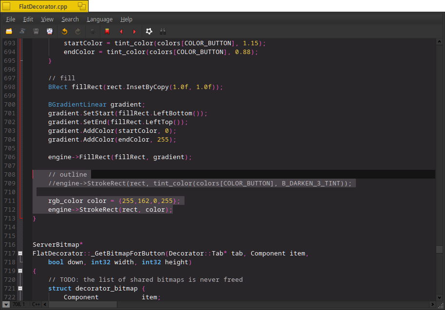
Lets supouse that i want to change the color of the outline in the tab buttons, ok, probably i do the next change in the _DrawBlendRect method:
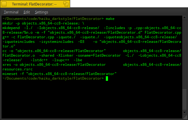
Next, i need to build the code, for that… simple run make at the root of the decorator:
Ok, now i need to drop the generated binary into my add-ons decorator folder; copy the binary “FlatDecorator”:
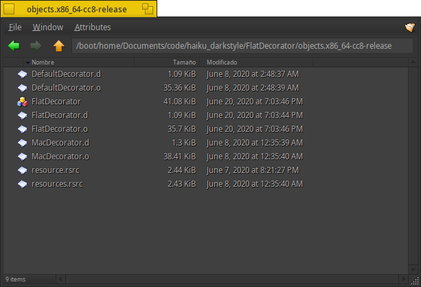
and drop into:
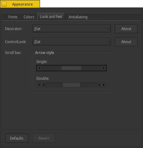
Lets try my new decorator selecting from the appearance settings:
And this is the result:
There is not much more to explain, the rest depends on our creativity and knowledge of the language. This, IMO, is the simplest and least dangerous way to make your own decorator for haiku-os.
Starting to modify the ControlLook
For the controlLook the steps are similar of the Decorator, let’s do a quick review with the controlLook:
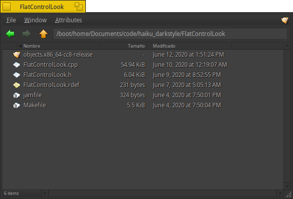
With your already cloned repository, we will open the folder that contains the controllook that we are going to modify, that is in /FlatControlLook
Lets start to inspect and modify the code of FlatControlLook/FlatControlLook.cpp, for example:
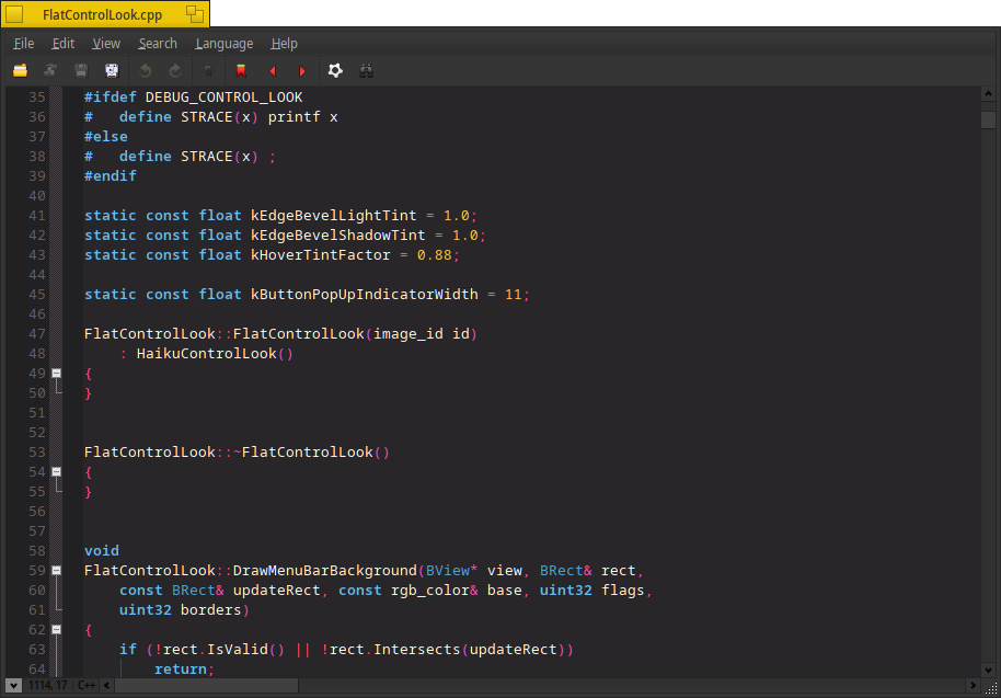
FlatControlLook::FlatControlLook(image_id id)
	: HaikuControlLook()
{
}


FlatControlLook::~FlatControlLook()
{
}
This code, tells to the superclass HaikuControlLook that you gonna to rewrite some methods.
Some importat methods to inspect here:
DrawMenuBarBackground
This method is who draws the background of the menu bar
_DrawButtonFrame
This, drwas the frame of the controls type button
DrawButtonBackground
one of the most importants, because this method is called everywere… his job is draw the background of the buttons, but is called for the deskbar, the menus, and the combos too
_MakeGlossyGradient
Yes, this is the method that draws the ugly lighted backround gradient of the buttons
DrawGroupFrame
Used to provide an identifiable grouping for other controls. Typically, to subdivide a form by functions
DrawActiveTab
The active tab, in the default implementation have a gradient. In my code its modified to look more flat
DrawButtonWithPopUpBackground
if you come, from linux or windows this is commonly called “Combobox” and in this implementation has a special glue with the buttons
More important methods are implemented in the default decorator, but remember that this class extends of the haikuDecorator and here are not implemented.
Making a litle change:
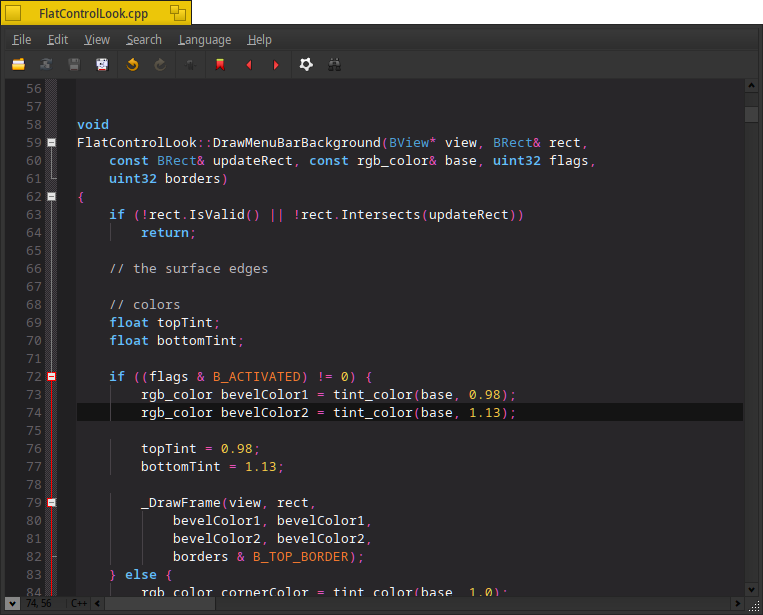
I love the gradients! but i need they look great, very sutil… suppose that i want to modify the menubar gradient, ok see in this line, apparently he is setting the amount of tint for the initial color and its final color; Let’s modify it:
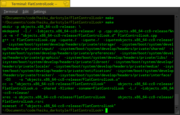
ok, now; build it:
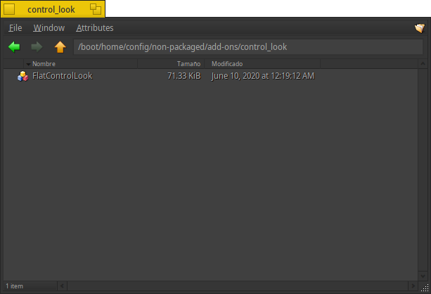
Lets to try the result droping the build in our add-ons/control_look folder.
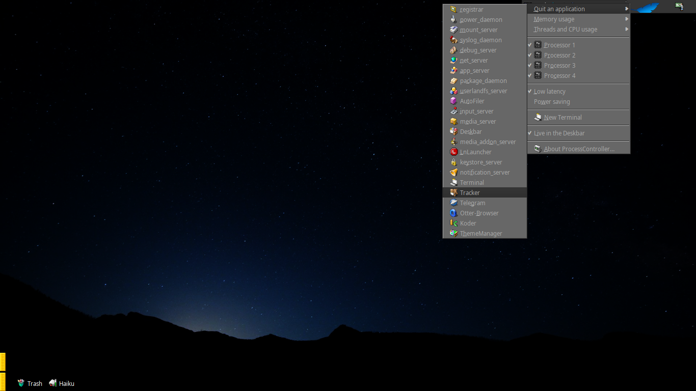
Once you dropped the controllook, select the new controllook from the appearance settings and RESTART the tracker using the “processcontroler” (this will be relaunched automatically):
And looks awesome!

Make your own color theme
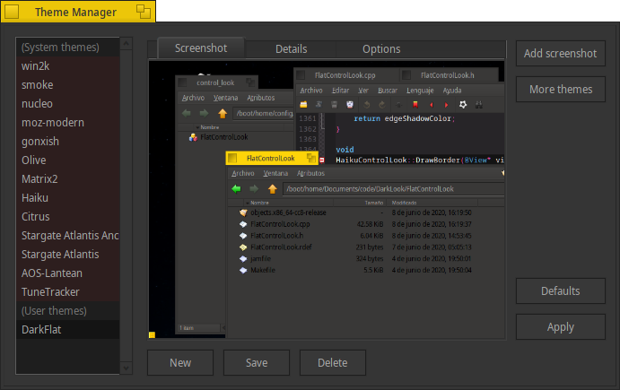
Its pretty easy to make you own theme in Haiku. I recommend to read a little of history in the next link before continue: The bowels of the Theme Manager, or How to make Haiku as ugly as Zeta
The simplest way, is modify the colors of each component in the appearance dialog; when you finish and your work looks good, go to ThemeManager and click in “new”, let a new name and save it… If you want, you can add a screenshot to recognize the scheme fastest in a one simple look.
Fun!
There is not much more to learn, from here, is only modify, fail and persist. I hope you have as much fun as I have!