Blurry Fonts in Haiku OS: How 'Light Hinting' Saved My Eyes
For a while now, I’ve been noticing that Haiku OS had a bit of an issue—at least to my eyes—with how it rendered its fonts. On window tabs, the typography looked heavily smudged, to the point where it was actually hard to read smoothly. For months, my temporary fix on every clean install was simply changing the default tab font to a different one. But after doing this repeatedly across multiple machines, I got tired of the band-aid fix and decided to dig into the root cause: Why does Haiku render bold fonts so poorly? I dove into the source code and the rendering engine, and the answer led me to a fundamental concept in digital typography: Hinting.
What is Hinting?
The letters in modern fonts are mathematically perfect vector curves. The problem is that our screens are not perfect; they are rigid grids made up of tiny squares (pixels).
When a curved or diagonal line of a letter falls right in the middle of a pixel, the operating system doesn’t know whether to paint it black or white. To smooth it out, it introduces gray pixels (antialiasing). If this process isn’t tightly controlled, the text ends up looking blurry, distorted, or muddy.
In short, Hinting is a set of mathematical instructions embedded inside the font file that tells the operating system how to subtly “distort” or snap the outline of a letter so its edges align perfectly with the screen’s physical pixels. It is what makes text look incredibly sharp and legible on standard-resolution monitors.
Haiku’s Problem: The “Smudge Effect”
While investigating Haiku’s source code, I discovered that the system applies a Normal (or strong) hinting profile by default. While this sounds logical on paper, this algorithm has a severe flaw when dealing with bold (Bold) fonts: it overestimates their thickness.
The algorithm tries to force the edges of a letter that is already naturally thick against the pixel grid. To compensate for this forced alignment, the rendering engine generates an excessive amount of gray antialiasing pixels on the sides. The physical result on your screen is that bold letters turn into a blurry smudge, losing all definition—especially inside the closed counters of characters like a, e, or o.
The Solution: Switching to “Light Hinting”
The breakthrough came when I implemented Light Hinting into the system.
Unlike the normal mode, Light Hinting is much more permissive: it prioritizes the fidelity of the font’s original curves over a rigid pixel alignment. It strictly adjusts the font only on the vertical axis (so letters don’t “bounce” up and down on the baseline), but leaves the horizontal axis completely unrestricted.
By no longer forcing the typography horizontally, the engine respected the native design of the bold font. The letters regained their internal shapes, the blurry gray borders disappeared, and the text transformed from a muddy smudge into something clean, sharp, and highly readable.
A Modern Industry Standard
Haiku is not the first to hit this wall. In fact, the tech industry realized this issue over a decade ago, and every major modern operating system has migrated to Light Hinting (or similar approaches) by default:
Linux:
The Linux world relies on FreeType (the exact same font engine Haiku uses under the hood). Historically, Linux used a strong hinting profile that made fonts look jagged or overly thin. Years ago, major distributions like Ubuntu and Fedora, along with desktop environments like GNOME and KDE, switched their default setting to “Slight” (Light). The reason was identical: aggressive hinting ruined modern font aesthetics and smudged bold text. Today, a fresh Ubuntu install comes with Light Hinting out of the box.
Android:
From its earliest versions, Google’s mobile OS adopted vertical Light Hinting to ensure small text remained legible on mobile screens without bleeding into blurry artifacts.
Apple (macOS):
Apple has always held a strict philosophy: respect the type designer’s original vision at all costs. Since the early days of Mac OS X, they implemented an extreme version of Light Hinting (practically disabling horizontal hinting altogether). They preferred a slightly softer look on older monitors over distorted letterforms. With the advent of Retina (HiDPI) displays, this became the absolute standard.
The Final Result
Here is the difference. It might look subtle at first glance, but in daily desktop usage, the change is massive and the visual comfort is noticed instantly:
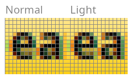
- Normal Hinting (Left): Notice how the internal counters of both the “e” and “a” are partially obstructed by darker pixels. Because the algorithm forces the font edges to align strictly with the horizontal pixel grid, the characters become thicker, reducing the inner negative space. This results in the blurry, slightly muddy appearance on lower-resolution screens.
- Light Hinting (Right): By relaxing the horizontal grid restrictions, the font preserves its original shapes. Look at the center of the “e” and the opening of the “a”—the inner spacing is kept open and clear. The letters retain their intended geometry, making the text sharper and easier to read.
- On the left (Light Hinting): The letters maintain their bold weight, but the edges are perfectly clean. The inner counters of the q and o have reclaimed their white space, allowing the typography to “breathe.” The contrast against the background is sharp, making it infinitely easier to read.
- On the right (Normal Hinting): Look closely at the words “quick” or “brown”. The letters look excessively “fat,” and their internal counters (like the loops in the q, u, or o) are heavily compressed. The gray antialiasing on the edges is so thick that it creates that “smudge effect” mentioned earlier. The text almost looks slightly out of focus.
With this change, Haiku OS doesn’t just get its sharpness back—it aligns itself with modern software engineering best practices for font rendering. My eyes are incredibly grateful!